How to Use T-Shirt Mockups in Social Media Ads That Actually Convert
Scrolling through Instagram or Facebook, you’ve seen them a hundred times: a plain shirt floating on a white background, slapped into an ad with zero context. It gets ignored. Meanwhile, a shirt shown on a real-looking model, in a lifestyle setting, with the right lighting, stops the scroll. The difference isn’t the product — it’s the presentation. A t shirt mockup is often the cheapest, fastest way to bridge that gap between “just a design” and “something I’d actually buy.”
This article breaks down how to use mockups strategically in paid social campaigns, not just as a design shortcut but as a conversion tool.
Why Mockups Matter More Than People Think
Most sellers treat mockups as a formality — something you slap your design onto before uploading to Shopify. But in an ad context, the mockup is the pitch. You have roughly 1.5 seconds to convince someone mid-scroll that this product is worth their attention.
A good mockup does three things simultaneously:
- Shows the print quality and placement clearly, without distortion
- Suggests a lifestyle or identity the viewer wants to associate with
- Builds trust that the product in the ad matches what they’ll receive
Bad mockups — low-res, oddly lit, or clearly fake-looking — do the opposite. They trigger the same skepticism people have toward stock photos in scam ads. This is why many print-on-demand sellers and independent apparel brands rely on dedicated mockup resources rather than in-house photography, especially early on when budgets are tight.
Choosing the Right Mockup Style for Your Audience
Not every mockup style works for every product or platform. Before building an ad, it helps to think about what you’re actually trying to prove to the viewer: the quality of the design, the identity of the brand, or the lifestyle around the product. Each of the three main mockup styles answers a different one of these questions.
Flat lay mockups — when the design is the hero
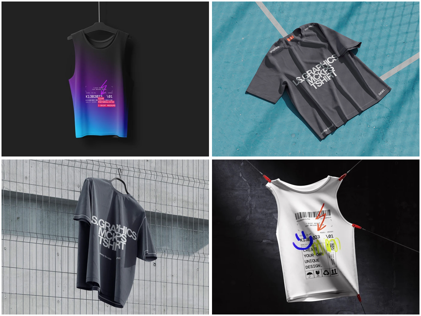
A flat lay shows the shirt laid out on a flat surface, sometimes with props around it (a coffee cup, sunglasses, a skateboard). This works best when the graphic itself needs to be seen clearly, with no distortion from body movement or fabric folds.
Example: A brand selling bold typography quotes or meme-based designs will get more value from a flat lay than a lifestyle shot, because the ad’s whole job is to make the text or artwork instantly readable in the first second of the scroll.
On-model mockups — when you’re selling identity
An on-model mockup shows the shirt worn by a person, usually against a plain or softly blurred background. This style proves fit, drape, and how the design actually looks on a body — details a flat lay can’t communicate.
Example: A fitness apparel brand running Instagram ads will typically use on-model shots because the buyer needs to picture themselves wearing it during a workout, not just see the print in isolation.
Environment mockups — when context sells the product
An environment mockup places the model in a real setting — walking through a city, sitting in a café, at the beach, backstage at a concert. Here, the background isn’t decoration; it’s doing half the selling. The viewer isn’t just evaluating a shirt, they’re imagining a moment they want to be part of.
Example: A streetwear brand launching a summer collection will often shoot (or mock up) the same shirt in an outdoor, sun-lit city scene, because the setting reinforces the seasonal drop and makes the product feel current rather than generic.
How to decide which one to use
A simple way to choose is to match the mockup style to what the ad needs to prove:
- Flat lay — the design/graphic is unique or detailed enough to be the main selling point
- On-model — fit, silhouette, or size range is the main concern for the buyer
- Environment — the brand sells a feeling, season, or lifestyle as much as a product
Many sellers test all three in the same ad set rather than guessing, since performance often depends more on the specific audience than on any general rule.
Building Ad Creative Around a Mockup
A mockup alone isn’t an ad. The real conversion work happens in how you frame it.
Practical approaches that consistently perform well:
- Before/after transitions — starting with a blank shirt, then revealing the printed mockup, which plays well as a short video ad
- Multiple angle carousels — front, back, and close-up detail shots using the same base mockup file, keeping visual consistency across the whole ad set
- UGC-style framing — placing the mockup image inside a “phone screenshot” template so it blends with organic content in the feed
Resources like ls.graphics have become popular among small apparel sellers precisely because they offer high-resolution, realistic PSD files — including environment-based scenes — that can be adapted quickly across all of these formats without needing a full photoshoot for every design variation. This matters most for sellers who don’t hold physical inventory, since print-on-demand businesses on Etsy and Shopify almost universally rely on mockups instead of product photography, reusing the same base file across dozens of design variations while keeping the model, lighting, and pose identical for brand consistency.
Making It Work for Your Own Campaigns
There’s no universal winning mockup — what converts depends on your audience, platform, and product positioning. But the pattern across successful campaigns is consistent: realistic presentation, platform-appropriate styling, and enough creative volume to actually test what resonates.
Start small. Pick two or three mockup styles, build simple ad variations around each, and let the data — not your personal preference — decide which one earns the click. The brands winning at scale on social media aren’t necessarily the ones with the biggest photography budgets; they’re the ones testing the fastest and paying attention to what their audience actually stops scrolling for.