Simple Ways to Make Hand Lettering Look More Playful
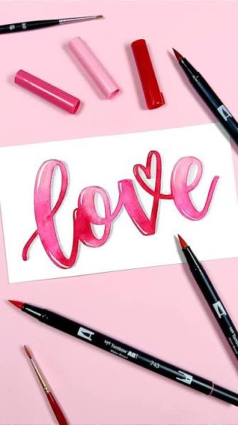
Hand lettering can turn simple words into creative artwork. One easy way to make your designs more playful is to experiment with shapes, curves, and styles, such as drawing a rounded letter R with soft edges. Small changes like these can give ordinary letters more personality without making the design difficult.
Whether you are creating a poster, notebook title, greeting card, or school project, playful lettering can make your work stand out. You do not need professional tools or advanced drawing skills to get started.
Start With Rounded Letter Shapes
Sharp corners often make letters look formal or serious. Rounded corners create a softer and more cheerful appearance.
Try replacing straight edges with gentle curves. You can also make the ends of each stroke slightly wider and rounder. This technique works especially well with large capital letters.
Keep the basic shape readable while experimenting with its outline. Once you find a style you like, use the same rounded approach across the whole word.
Make Some Letters Bigger Than Others
Every letter does not need to have the same height. Changing the size of selected letters creates movement and makes your lettering feel more energetic.
For example, you can make the first letter larger and keep the remaining letters smaller. Another option is to make important words much bigger than supporting text.
Size variation also helps create a clear visual hierarchy. The reader notices the most important part of the design first.
Experiment With Bubble Letters
Bubble letters are a simple choice when you want a fun and friendly style. They use thick strokes, smooth curves, and rounded shapes that work well for posters and creative projects.
Start by lightly writing a normal letter with a pencil. Draw a thicker outline around it and keep the corners smooth. After creating the final outline, erase the original guide.
You can explore bubble-letters.net when looking for inspiration related to different bubble lettering styles and letter shapes. Studying several examples can help you understand how simple letters become more decorative.
Add Small Doodles Around Your Words
Small drawings can instantly make lettering feel more playful. Stars, hearts, flowers, clouds, dots, lightning bolts, and smiley faces are easy options.
The doodles should support the lettering instead of covering it. Place them inside empty areas or around the edges of your main words.
Try to repeat similar shapes throughout your design. Repetition helps the artwork look connected instead of random.
Play With Letter Heights
A perfectly straight row of letters can sometimes look too formal. Moving individual letters slightly up or down gives the word a hand-drawn personality.
You can also tilt some letters gently to the left or right. Avoid using extreme angles because they may reduce readability.
The goal is controlled imperfection. Your lettering should look playful while remaining easy to understand.
Use Thick and Thin Strokes
Changing stroke thickness creates visual interest. Thick downstrokes combined with thin upward lines can give lettering more depth.
You can practice this technique with a brush pen, marker, or even a normal pencil. Draw the letters first and manually thicken selected sections afterward.
Beginners should focus on consistency rather than perfection. Regular practice will make the difference between thick and thin strokes look more natural.
Add Shadows to Your Letters
A simple shadow can make flat lettering appear three-dimensional. Choose one direction for the shadow and apply it consistently to every letter.
For example, place a small shadow along the right and bottom sides of each letter. Keeping the same distance around the word creates a cleaner result.
You can leave the shadow empty, fill it with lines, or use small patterns. Even a basic shadow can make a simple word more noticeable.
Fill Letters With Patterns
Large letters provide plenty of space for decorative patterns. Instead of using one solid fill, try adding stripes, dots, waves, checks, or tiny shapes.
Do not use too many patterns in one design. A few repeated details usually create a stronger visual effect.
You can also leave some letters plain. The contrast between simple and decorated letters can make the patterned areas stand out.
Create Bouncy Lettering
Bouncy lettering moves letters above and below an imaginary baseline. This technique creates a relaxed and energetic appearance.
Start by writing a word normally. On your next attempt, move some letters slightly lower and others slightly higher.
Keep the changes small at first. Too much movement can make the word difficult to read, especially when you use decorative fonts.
Combine Different Lettering Styles
You do not need to use one lettering style throughout your entire project. Mixing two complementary styles can create a more interesting design.
For example, combine bold bubble letters with smaller handwritten text. You can also pair thick capital letters with simple cursive words.
Try limiting yourself to two main styles. Using too many different designs can make the artwork feel crowded.
Stretch and Squash Letter Shapes
Changing the proportions of letters is another easy way to create personality. Make some letters tall and narrow while making others short and wide.
This method works best with casual artwork where perfect typography is not required. Posters, notebook covers, handmade cards, and classroom projects are good examples.
Always check readability after changing the proportions. Creative lettering should still communicate the word clearly.
Add Decorative Lines and Details
Simple lines can completely change the appearance of hand lettering. Add small lines inside thick letters or place decorative strokes around important words.
Underlines, curved banners, arrows, and swashes can also help guide attention. Use these details to highlight the main part of your message.
Leave enough empty space between decorations. Good spacing prevents the design from becoming visually overwhelming.
Practice With Pencil Before Using Ink
Pencil sketches give you freedom to experiment. You can adjust letter size, spacing, shape, and position before committing to the final design.
Draw lightly so you can erase unwanted marks easily. Once the composition looks balanced, trace the final lines with a pen or marker.
This process is especially useful for beginners because mistakes become part of the planning stage rather than the finished artwork.
Keep Your Style Consistent
Playful lettering can include unusual shapes, but the overall design still needs consistency. Repeat similar curves, stroke widths, shadows, and decorative elements.
Consistency helps different letters feel like part of the same design. It also gives handmade artwork a more polished appearance.
You can create your own simple rules before starting. For example, decide that every letter will have rounded corners and a small shadow.
Final Thoughts
Making hand lettering more playful does not require expensive tools or professional drawing experience. Rounded shapes, bubble styles, doodles, shadows, patterns, and size changes can transform basic writing into expressive artwork.
Start with simple techniques and experiment with different combinations. With regular practice, you can develop a playful hand-lettering style that feels creative, readable, and completely your own.